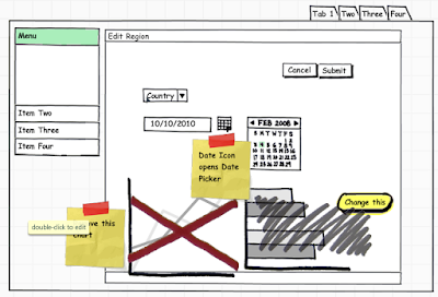
One of my biggest pet peeves is when I get a functional or technical spec with modified screen shots of existing applications for the UI mockups. I'm not a graphic artist or a UI expert but I do know that taking a screen shot of a similar application, then spending several hours moving things around in Paint isn't very good. Using MS Paint, or similar applications, would be like developing your application using a typewriter (I've included a picture for those that have never used one :-).
 I know some people have developed basic APEX applications and used screen shots for their UI mockups. I think APEX is a great tool for creating demo applications but it shouldn't be used for mockups. People reviewing the design may get carried away with the specifics since it looks like a real application.
What should you use to create application mockups? Personally I like a good old-fashion hand drawn diagram (I've been known to ask colleagues to give me their mockups on scrap paper). Though they are quick they don't work well in documents and they aren't great when doing several design iterations. Wireframe diagrams are an excellent alternative as they're exactly like hand drawn diagrams with pre-defined shapes.

Why use wireframe diagrams?
- Quick to develop (the example above took me 2 minutes to create)
- Easy to modify
- Focus on flow and useability, not specifics
- Cheap/Easy to do multiple design iterations
The list could go on, but I'll stop there. I'd like to emphasize on the fact that people will focus on specifics rather than the flow and usability of the application when looking at screen shots. For example: if you use have a screen shot with a drop down list of 100 countries and you only include 2 or 3 in the diagram, readers may wonder where the other 100 or so countries are etc. They aren't focused on the fact that it's a drop down list with countries, rather there's something wrong with the list. With a wireframe diagram it will be extremly clear that it's a drop down list of countries with no real focus on the values inside the select list.
I've you're looking for an application to do wireframe diagrams I'd recommend Balsamiq. I've been really impressed with it so far as it allows me to do UI mockups really quickly (I have no affiliation with Balsamiq, so please don't take this as an advertisement). Of course they're many other tools out there that will do this so I encourage you to find one that is suitable for your organization.

Is it worth the price?
ReplyDeleteHi LG,
ReplyDeleteYou should look at how much time you spend working on screen mockups. If you're focusing all your time on making it look good (i.e. MS Paint) rather than the flow of the application then you really should be looking at a better tool to do these diagrams.
So to answer your question, yes I think it's worth it!
Martin
Many of my design mockups are done on whiteboards and scrap paper, so I just grab the nearest digital camera and take a few shots. Then I drop the photos into an editor and knock them down to black and white and crop accordingly.
ReplyDeleteCustomers love seeing the exact diagram from the conversation in the documentation.